Themes
This feature is only available in paid plans. Learn More
This feature allows you to customize the overall look and feel of the drag-and-drop builder interface. We offer four out-of-the-box themes that can be easily applied to the builder, giving you the flexibility to choose between light and dark modes as well as different design styles.
Available Themes
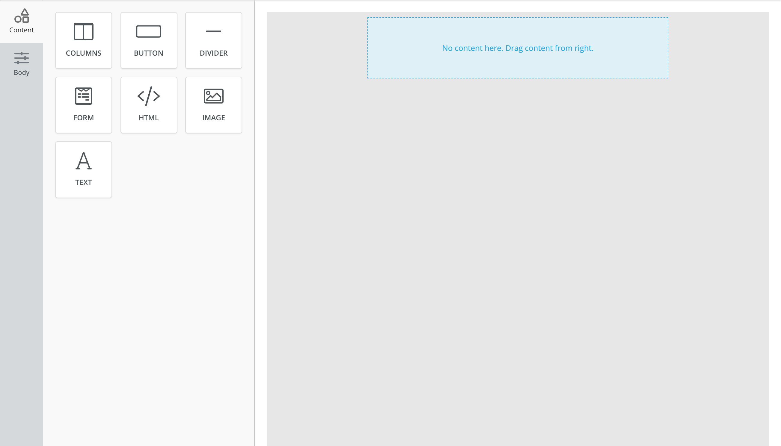
Modern (Light) – Default
A more contemporary design with light tones, providing a fresh and minimalist feel while maintaining clarity and usability. This is the default theme.
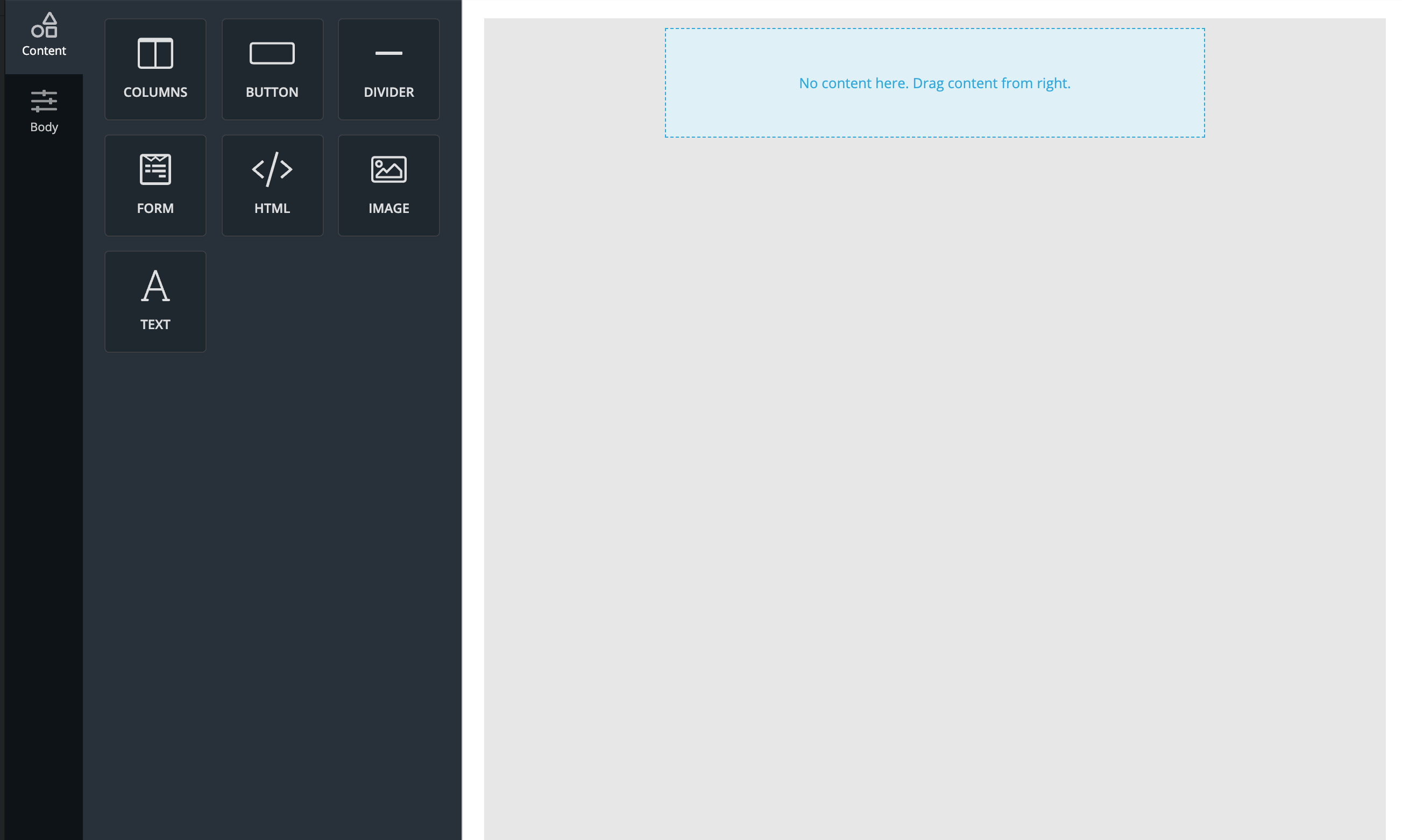
Modern (Dark)
A darker, modern interface that combines a sleek design with a minimalistic feel, ideal for users who prefer dark mode with a modern touch.
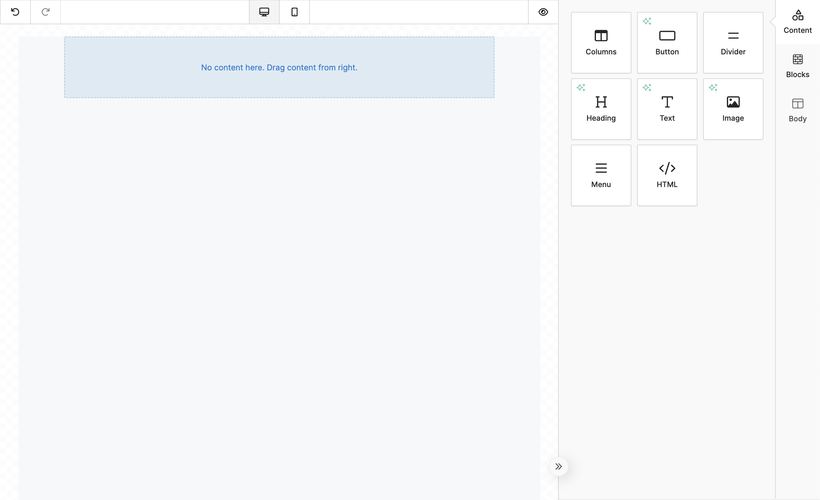
Classic (Light)
A clean, traditional interface with a light background, designed for clarity and simplicity.
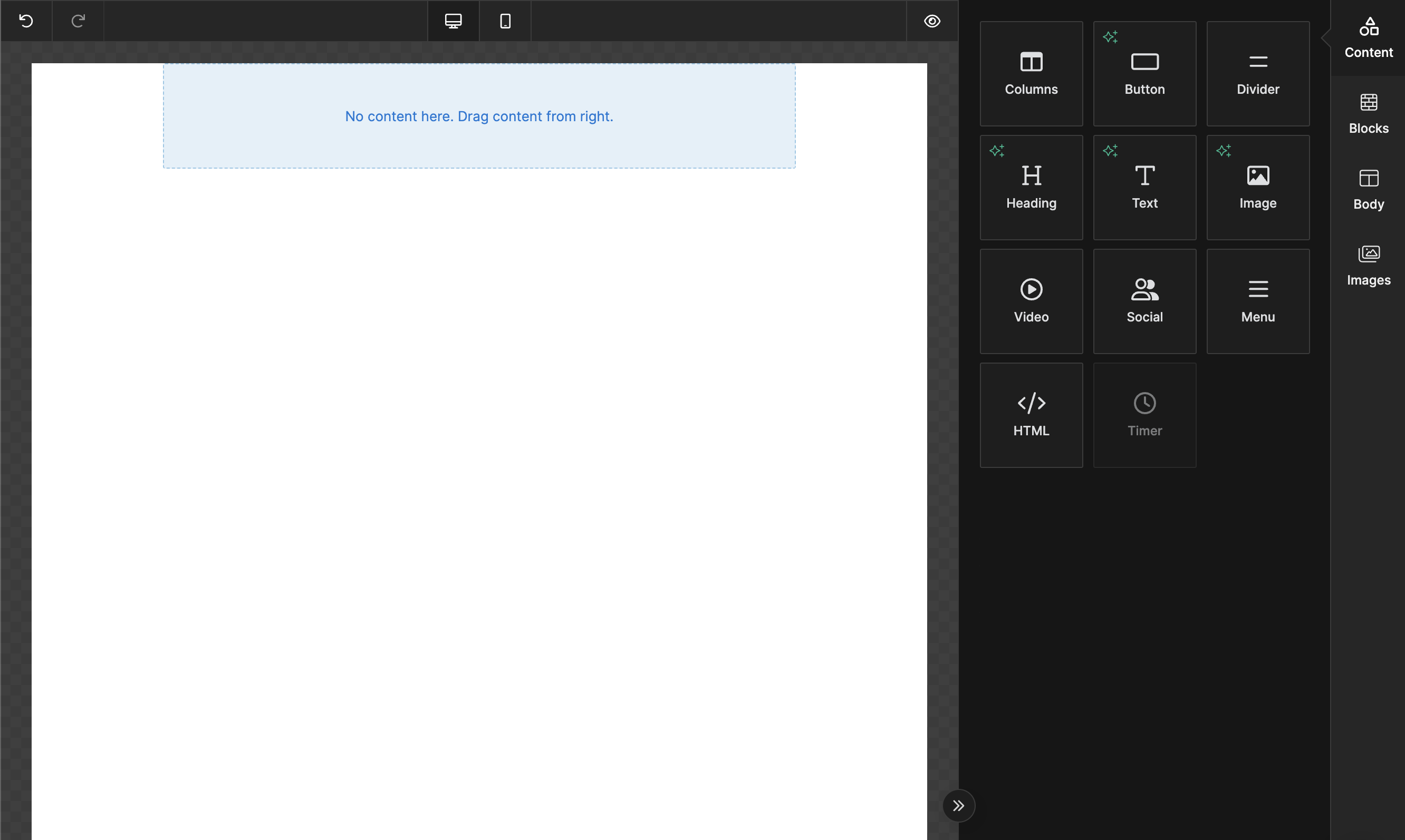
Classic (Dark)
A darker version of the classic theme, ideal for users who prefer a low-light interface or want a more modern, sleek look.
Setting a Theme
You can configure the theme for the builder during initialization using the unlayer.init() method. By default, the builder is set to the Classic (Light) theme, but you can easily switch to any of the available themes.
Example of setting a theme:
unlayer.init({
  appearance: {
    theme: 'modern_light',
  },
});
Or you can change the theme on the fly like this:
unlayer.setAppearance({
  theme: 'modern_dark',
});
Theme Options
- modern_light (default)
- modern_dark
- classic_light
- classic_dark
Customizing Themes
If the out-of-the-box themes don't fully meet your needs, you can further customize the builder's appearance using the Custom JS / CSS options. This allows you to tweak the existing themes or create a completely new look that fits your brand.
Best Practices
- Consistency with Your Brand: Choose the theme that best aligns with your platform's overall design and user experience. You can also apply custom branding elements via CSS to make the builder interface feel more integrated with your application.
- Light vs. Dark Mode: Offering both light and dark themes provides users with a more personalized experience. You can also allow users to switch between themes based on their preferences, enhancing accessibility and comfort, especially in low-light environments.
By utilizing this feature, you can create a visually appealing and cohesive environment for your users, ensuring that the builder interface matches your application's aesthetic while providing a comfortable and flexible design experience.