Create a Custom Tool
This tutorial will get you started with your first custom tool using our JavaScript API.
Before you proceed, please make sure you have read the overview and understand the following:
The following JavaScript has to be passed in the customJS parameter when initializing Unlayer. registerTool, registerPropertyEditor, createViewer and createWidget methods are only available there.
Register your Tool
The first step is to register your custom tool using the registerTool method.
unlayer.registerTool({
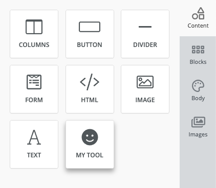
name: 'my_tool',
label: 'My Tool',
icon: 'fa-smile',
supportedDisplayModes: ['web', 'email'],
options: {},
values: {},
renderer: {
Viewer: unlayer.createViewer({
render(values) {
return '<div>I am a custom tool.</div>';
},
}),
exporters: {
web: function (values) {
return '<div>I am a custom tool.</div>';
},
email: function (values) {
return '<div>I am a custom tool.</div>';
},
},
head: {
css: function (values) {},
js: function (values) {},
},
},
validator(data) {
return [];
},
});
It needs some configuration options which are explained below:
| Option | Description |
|---|---|
| name | Unique name for your tool |
| label | Label that users see in the tools panel |
| icon | Icon that users see in the tools panel. The value can be class name of any fontawesome icon, or a URL for your icon's image |
| supportedDisplayModes | Which display modes will this tool work in. Default value is ['email', 'web'] |
| usageLimit | Optional. You can set a limit to the number of times this tool can be used in a design |
| options | This is where we define tool properties and property editors |
| values | Initial values for our tool's properties |
| renderer | This is where we will add a Viewer , exporters and head |
| supportedByAI | Optional. Set to false to hide this tool from the AI Copilot |
| validator | You can add a validator function to check for issues in the values. For example, you can check values of properties to make sure everything looks correct. These errors/warnings would show up in the Audit tab. Learn More |
If you are using React to create a custom tool or property editor, you can reuse Unlayer's React. We have unlayer.React and unlayer.ReactDOM available globally. This is recommended to avoid loading React twice and run into version conflicts. Check our React Example.
Add Tool Properties
Every tool needs certain properties to create content. Properties are variables that the user can modify, such as colors, font sizes, text alignment, images, and more.
Each property is assigned a property editor which is a UI control widget used by the user to modify the property value. Check out the list of built-in property editors.
Color Picker Example
In this example, we will add 2 properties to our tool under a group called "Colors":
- Text Color
textColor - Background Color
backgroundColor
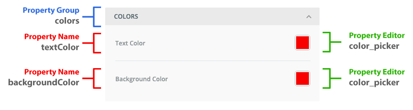
Let's define the property group and both the properties inside it. This will be done in the options object. Each property group should have a unique key in options so we will call this group colors.
We will name the properties textColor and backgroundColor and use the built-in color_picker editor widget for both of them. We will give each property a default value of #FF0000.
For the Renderer, we will use the textColor and backgroundColor in the HTML to apply those colors to our template. These properties will be available in the values object passed to the Viewer and the exporters.
unlayer.registerTool({
  name: 'my_tool',
  label: 'My Tool',
  icon: 'fa-smile',
  supportedDisplayModes: ['web', 'email'],
  options: {
    colors: {
      // Property Group
      title: 'Colors', // Title for Property Group
      position: 1, // Position of Property Group
      collapsed: false, // Initial collapse state
      options: {
        textColor: {
          // Property: textColor
          label: 'Text Color', // Label for Property
          defaultValue: '#FF0000',
          widget: 'color_picker', // Property Editor Widget: color_picker
        },
        backgroundColor: {
          // Property: backgroundColor
          label: 'Background Color', // Label for Property
          defaultValue: '#FF0000',
          widget: 'color_picker', // Property Editor Widget: color_picker
        },
      },
    },
  },
  values: {},
  renderer: {
    Viewer: unlayer.createViewer({
      render(values) {
        return `<div style="color: ${values.textColor}; background-color: ${values.backgroundColor};">I am a custom tool.</div>`;
      },
    }),
    exporters: {
      web: function (values) {
        return `<div style="color: ${values.textColor}; background-color: ${values.backgroundColor};">I am a custom tool.</div>`;
      },
      email: function (values) {
        return `<div style="color: ${values.textColor}; background-color: ${values.backgroundColor};">I am a custom tool.</div>`;
      },
    },
    head: {
      css: function (values) {},
      js: function (values) {},
    },
  },
  validator(data) {
    const { defaultErrors, values } = data;
    return [];
  },
});
Property Group
Property group is a collapsable panel that is used to organize properties into a group. This makes the experience of editing a template simpler and easier.
The options object defines all the property groups and properties available for your custom tool. Here's a breakdown of the available options:
| Option | Description |
|---|---|
| title | Title for the property group shown in the panel |
| position | Position order of the property group (lower numbers appear first) |
| collapsed | This boolean controls the initial collapse state of the group |
| options | Contains all properties within this group |
Custom Property Editor
In the example above, we used a built-in color_picker property editor. We have many built-in property editors available but many times you may want to use a custom property editor that is tightly integrated with your application.
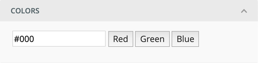
Here's a small example where we add a custom color picker property editor. We'll call it my_color_picker. We will use the registerPropertyEditor method to register it.
unlayer.registerPropertyEditor({
  name: 'my_color_picker',
  Widget: unlayer.createWidget({
    // JSON Schema for AI Copilot support
    schema: {
      type: 'string',
      description: 'Hex color value (e.g. #ff0000)',
    },
    render(value, updateValue, data) {
      return `
        <input class="color-value" value=${value} />
        <button class="red">Red</button>
        <button class="green">Green</button>
        <button class="blue">Blue</button>
      `;
    },
    mount(node, value, updateValue, data) {
      var input = node.getElementsByClassName('color-value')[0];
      input.onchange = function (event) {
        updateValue(event.target.value);
      };

      var redButton = node.getElementsByClassName('red')[0];
      redButton.onclick = function () {
        updateValue('#f00');
      };

      var greenButton = node.getElementsByClassName('green')[0];
      greenButton.onclick = function () {
        updateValue('#0f0');
      };

      var blueButton = node.getElementsByClassName('blue')[0];
      blueButton.onclick = function () {
        updateValue('#00f');
      };
    },
  }),
});
Once our new property editor is registered, you can use it just like the built-in property editors when registering your tool. The configuration options are explained below:
| Option | Description |
|---|---|
| name | Unique slug for your property editor widget. You will have to provide this in options as a widget when registering your tool. |
| Widget | This is the UI widget. If you are using React, this would be a Component. If you are using vanilla JavaScript, you will use createWidget. |
Widget
For each property editor, you have to pass a Widget. If you are using React, this would be a Component. If you are using vanilla JavaScript, you will use the createWidget function.
JavaScript
The unlayer.createWidget function would be passed an object with the following attributes. You can check the full example.
| Attribute | Description |
|---|---|
| render | This is the HTML of your widget. It is passed the following arguments: value is the current value of this property updateValue is the function to update the value of this property. The first argument has to be the new value, and the second argument is optional data that can be used in the transformer to update values for other properties. data is the optional data passed by your application |
| mount | This gets called when your widget is mounted. You can attach events to the HTML elements here. It is passed the following arguments: node is the DOM ref to the HTML element that you created in the render method. value is the current value of this property updateValue is the function to update the value of this property. The first argument has to be the new value, and the second argument is optional data that can be used in the transformer to update values for other properties. data is the optional data passed by your application |
| schema | A JSON Schema object describing the value shape produced by this widget. Used by the AI Copilot to understand what fields your custom property editor supports, so it can generate content for your custom tool. |
React
If you are using React, you can create the same widget as a Component. You can check the full example here.
import React from 'react';

const MyColorPicker = (props) => {
  const { label, value, updateValue, data } = props;

  return (
    <div>
      <input
        class="color-value"
        defaultValue={value}
        onChange={(e) => updateValue(e.target.value)}
      />
      <button class="red" onClick={() => updateValue('#f00')}>
        Red
      </button>
      <button class="green" onClick={() => updateValue('#0f0')}>
        Green
      </button>
      <button class="blue" onClick={() => updateValue('#00f')}>
        Blue
      </button>
    </div>
  );
};

unlayer.registerPropertyEditor({
  name: 'my_color_picker',
  Widget: MyColorPicker,
});
If you are using React to create a custom tool or property editor, you can reuse Unlayer's React. We have unlayer.React and unlayer.ReactDOM available globally. This is recommended to avoid loading React twice and run into version conflicts. Check our React Example.
Pass Data to Custom Tools
In some cases, your custom tool will need data from your application instance. You can pass that data when the Unlayer editor is initialized. Inside the tools object, you can add the data that your tool needs.
In this example, we will pass user's information. This data will be available in the values parameter to your tool's renderer and exporters. If your tool's name is my_tool, you will add an object called custom#my_tool and pass the data object in it. Replace NAME with the name of your tool.
You can see a full running example here: Live Demo
unlayer.init({
  ...
  tools: {
    'custom#NAME': {
      data: {
        name: 'John Doe',
        age: '27',
        photo: 'http://via.placeholder.com/350x150'
      }
    }
  }
});
Pass Data to Property Editors
Some property editors need data from your application programmatically. You can pass this data during the initialization.
Replace NAME with your tool's name and PROPERTY-NAME with the property's name. For example, if your tool's name is my_color_picker and property name is colorOptions, you will use custom#my_color_picker as the key and colorOptions as the property name.
You can see a full running example here: Live Demo
unlayer.init({
  ...
  tools: {
    'custom#NAME': {
      properties: {
        PROPERTY-NAME: {
          editor: {
            data: {
              "hello": "world"
            }
          }
        }
      }
    }
  }
});
Dropdown Example
Let's say your custom tool has a property that needs to use our built-in dropdown property editor. You can use the following example to pass options to the dropdown property editor.
In this example, our tool's name is contact_form and our property's name is department which is using a dropdown editor. We want the user to pick Sales, Customer Support, HR or Other from the dropdown.
You can see a full running example here: Live Demo
unlayer.init({
  ...
  tools: {
    'custom#contact_form': {
      properties: {
        department: {
          editor: {
            data: {
              options: [
                {label: "Custom Support", value: "Customer Support"},
                {label: "Sales", value: "Sales"},
                {label: "HR", value: "HR"},
                {label: "Other", value: "Other"}
              ]
            }
          }
        }
      }
    }
  }
});
Full Example
We have a full example of custom tools and custom property editors with the JavaScript API in our playgrounds. Check it out here.