Custom Buttons
This feature allows developers to add custom buttons to the text editor, providing the ability to extend and enhance the editor’s functionality with advanced controls. Custom buttons can be used for a wide range of purposes, such as inserting predefined text, triggering custom actions, or integrating with third-party services.
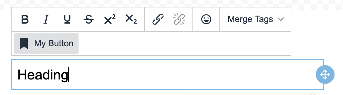
Adding Custom Buttons
You can add custom buttons to the text editor by configuring the customButtons array in the unlayer.init() method. Each button has several properties that define its name, label, icon, and actions.
unlayer.init({
  features: {
    textEditor: {
      customButtons: [
        {
          name: 'my_button', // Unique identifier for the button
          text: 'My Button', // The label that will appear on the button
          icon: 'bookmark', // Icon that will appear on the button (optional)
          onSetup: () => {}, // Function executed when the button is set up
          onAction: (data, callback) => {
            console.log(data.text); // Log or manipulate text editor data
            callback(data.text + ' Updated'); // Perform action and update the text
          },
        },
      ],
    },
  },
});
Button Attributes
- name: A unique identifier for the button, used to reference it programmatically.
- text: The label of the button that will be displayed in the editor’s toolbar.
- icon: The name of the icon to display on the button. Icons help users quickly identify the button’s purpose. For a full list of available icon names, visit TinyMCE Icon Identifiers .
- onSetup: A function that runs when the button is set up in the editor. You can use this function to initialize or prepare the button for use.
- onAction: The main action handler that runs when the user clicks the button. It receives two arguments:
- data: The current data in the text editor (e.g., text, formatting).
- callback: A function used to perform the desired action and update the editor with new content or behavior.
Custom SVG Icons
You can also use custom SVG code as the icon. Here’s an example:
unlayer.init({
  features: {
    textEditor: {
      customButtons: [
        {
          name: 'my_button',
          text: 'My Button',
          icon: '<svg />', // Insert your custom SVG here
        },
      ],
    },
  },
});
Best Practices
- Clear Naming and Icons: Choose meaningful names and icons for your custom buttons to make it clear to end-users what the button does.
- Action Feedback: Provide immediate visual feedback when users click a custom button. For example, you can update the text in the editor or show a notification indicating that the action was successful.
- Limit Complexity: While custom buttons can be powerful, keep their functionality focused and straightforward to ensure a smooth user experience.
By using this feature, developers can build custom, advanced controls directly into the text editor, allowing for powerful text manipulation and interaction capabilities that go beyond standard editor features.