Built-In Property Editors
Following is a list of built-in property editors available and their value formats.
Text Input

Widget
text
Default Value
String
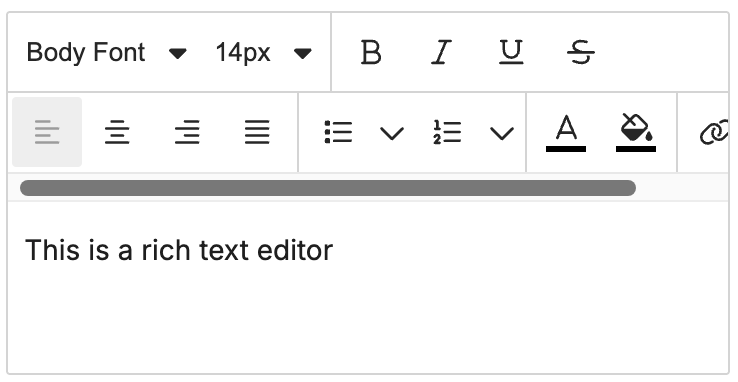
Rich Text Input V2
WARNING
rich_text was deprecated. Use rich_text_v2 instead for new custom tools. It's a direct replacement with the same HTML string format.
Widget
rich_text_v2
Default Value
String
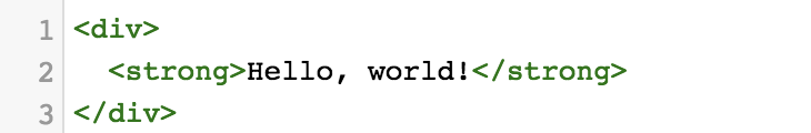
HTML Input
Widget
html
Default Value
String
Color Picker

Widget
color_picker
Default Value
String
Valid Values
- HEX Format
#FFF000 - RGB Format
rgba(0,0,0,0.5)
Text Alignment

Widget
alignment
Default Value
String
Valid Values
leftcenterright
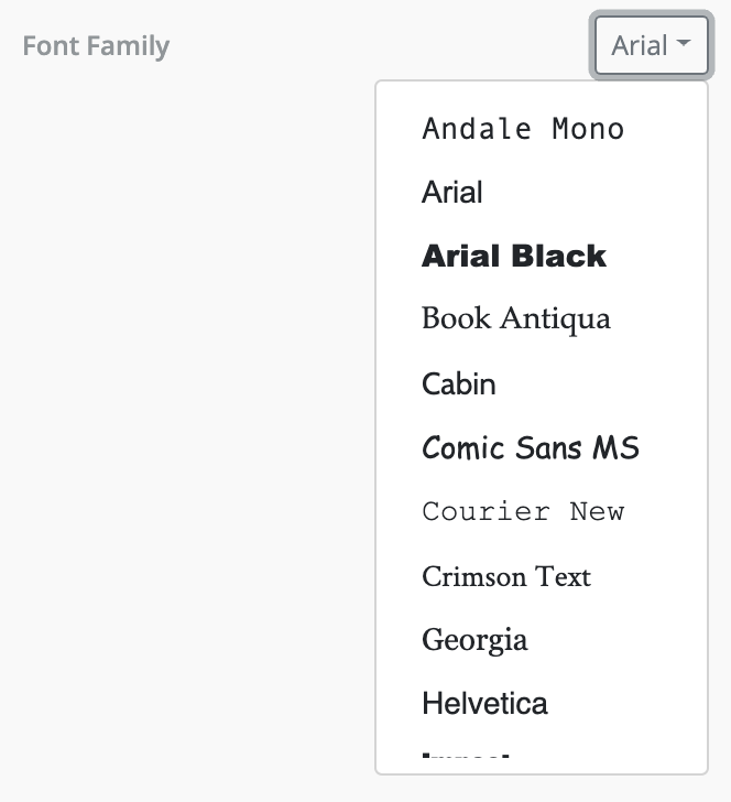
Font Family
Widget
font_family
Default Value
JSON
Valid Value
{
  "label": "Arial",
  "value": "arial,helvetica,sans-serif"
}
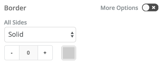
Border
Widget
border
Default Value
JSON
Valid Value
{
  "borderTopWidth": "0px",
  "borderTopStyle": "solid",
  "borderTopColor": "#CCC",
  "borderLeftWidth": "0px",
  "borderLeftStyle": "solid",
  "borderLeftColor": "#CCC",
  "borderRightWidth": "0px",
  "borderRightStyle": "solid",
  "borderRightColor": "#CCC",
  "borderBottomWidth": "0px",
  "borderBottomStyle": "solid",
  "borderBottomColor": "#CCC"
}
Counter

Widget
counter
Default Value
String
Example Values
10 25 50 etc
Image Uploader
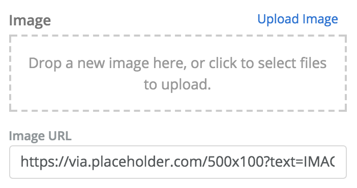
Widget
image
Default Value
JSON
Valid Value
{
  "url": "http://via.placeholder.com/350x150"
}
Toggle

Widget
toggle
Default Value
Boolean
Valid Values
truefalse
Link
Widget
link
Default Value
JSON
Valid Values
{
  "name": "web",
  "values": {
    "href": "http://google.com",
    "target": "_blank"
  }
}
Return Value
{
  "url": "http://google.com",
  "target": "_blank"
}
Dropdown
Widget
dropdown
Dropdown Options
The dropdown editor needs options to be passed as data. Learn more at: Passing Data to Property Editors
Date / Time
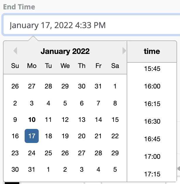
Widget
datetime
Default Value
String
Widget Params
hideTime (boolean)
hideCalendar (boolean)
format (string)
Custom Editors
If you want to build a custom property editor for advanced use cases, you can do that with our registerPropertyEditor API.