Custom Tools
What is a Custom Tool?
Custom tools are user-defined elements that extend the default functionality of the visual builder, allowing developers to create unique design components tailored to their specific needs. Unlike built-in tools, custom tools offer complete flexibility in terms of appearance, behavior, and interactivity. Developers can define how these tools behave, including custom properties, actions, and styling options.
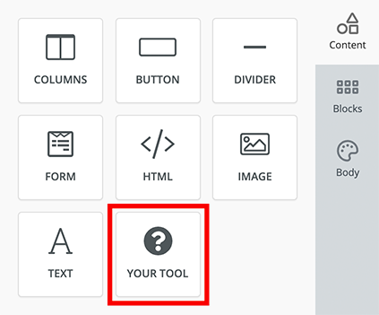
Custom tools integrate seamlessly into the editor’s interface, enabling users to drag, drop, and configure them just like built-in tools. This allows for advanced customization, supporting a wide range of use cases from specialized content elements to custom workflows. We know that every application is different and needs different tools to reach its full potential.

Every custom tool needs to have the following attributes to get running.
| Attribute | Description |
|---|---|
| Name | A unique identifier string for your tool |
| Label | A display label for your tool that the users will see |
| Icon | An icon for your tool from a choice of 700+ icons or a custom image |
| Supported Display Modes | Display mode this tool will work in (email, web or both) |
| Usage Limit | Number of times a tool can be used in a single design |
| Renderer | Renderer contains the content that the tool will create and export |
| Properties | A set of variables that your tool will need to create content |
Renderer
Renderer is where you define the content that your tool will create. This is done using a HTML template. Each renderer consists of a Viewer, Exporters and Head. In most cases, Viewer and Exporters contain the same HTML template but there are cases when these could be different.
Viewer
Viewer is the tool's template which will be visible to the user when they use your tool within the Unlayer editor.
Exporters
Exporters define the tool's HTML template which will be passed to your application when you call exportHtml. Depending on your supported display modes, each tool can have these 2 exporters:
- Web
This reflects what the output should be for each of the 2 display modes. HTML markup for email can be very different from a web page so this is where you can have the same tool working nicely for both display modes.
Head
Head is where you define any CSS or JavaScript that the tool will need to function. As the name says, these assets will be added to the <head></head> part of HTML. Learn more
Properties
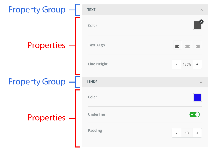
Every tool needs certain properties to create content. Properties are variables that the user can modify, such as colors, font sizes, text alignment, images, and more.
Property Group
Property group is a collapsable panel that is used to organize properties into a group. This makes the experience of editing a template simpler and easier.

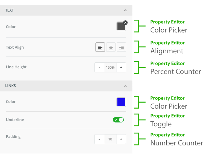
Property Editor
Each property is assigned a property editor which is a UI control widget used by the user to modify the property value. For example: color picker, slider, toggle, etc. We have many built-in property editors available, and you can also create a custom property editor.
