Tab Management
What is a Tab?
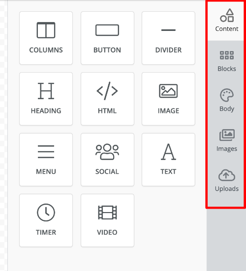
The side panel in the editor consists of various tabs like Content, Blocks, Body, Images, Uploads, etc. Each tab provides access to unique functions of the editor.
Enable / Disable Tabs
You can enable or disable any tab. For default tabs, the key is the tab name. For custom tabs, you have to prefix your tab name with custom#.
unlayer.init({
  tabs: {
    content: {
      enabled: true,
    },
    blocks: {
      enabled: false,
    },
    'custom#my_tab': {
      enabled: false,
    },
  },
});
Default Active Tab
By default, the "Content" tab is active when editor loads. You can change it to be any other tab.
unlayer.init({
  tabs: {
    blocks: {
      active: true,
    },
  },
});
Reposition Tabs
You can change the default positions of tabs.
unlayer.init({
  tabs: {
    content: {
      position: 1,
    },
    blocks: {
      position: 2,
    },
    'custom#my_tab': {
      position: 3,
    },
  },
});
Change Icon
You can change the icon of any tab. Icon can be class name of any fontawesome icon, or a URL for your icon's image.
unlayer.init({
  tabs: {
    content: {
      icon: 'fa-user',
    },
    blocks: {
      icon: 'https://my.cdn.com/blocks_icon.png',
    },
  },
});
Create a Custom Tab
This feature is only available in paid plans. Learn More
Register your Tab
The first step is to register your custom tab using the registerTab method.
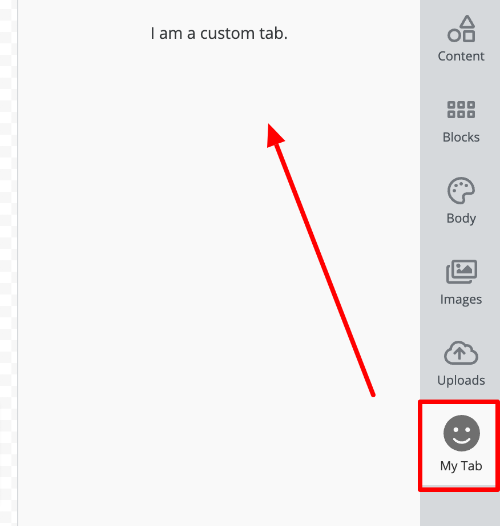
The following JavaScript has to be passed in the customJS parameter when initializing Unlayer. registerTab, and createPanel methods are only available there. Learn more.
unlayer.registerTab({
  name: 'my_tab',
  label: 'My Tab',
  icon: 'fa-smile',
  supportedDisplayModes: ['web', 'email'],
  renderer: {
    Panel: unlayer.createPanel({
      render() {
        return '<div>I am a custom tab.</div>';
      },
    }),
  },
});
It needs some configuration options which are explained below:
| Option | Description |
|---|---|
| name | Unique name for your tab |
| label | Label that users see in the side panel |
| icon | Icon that users see in the side panel. The value can be class name of any fontawesome icon, or a URL for your icon's image |
| position | Optionally, you can specify the position you want the tab to appear on |
| supportedDisplayModes | Which display modes will this tab work in. Default value is ['email', 'web'] |
Example using React
Here's an example that uses a React component.
const MyPanel = () => <div>I am a custom tab.</div>;

unlayer.registerTab({
  name: 'my_tab',
  label: 'My Tab',
  icon: 'fa-smile',
  supportedDisplayModes: ['web', 'email'],
  renderer: {
    Panel: MyPanel,
  },
});
Dev Tab
The Dev Tab is a special tab that appears in the editor's side panel when running in development environments. It provides developers with useful information about the editor configuration, authentication status, and version information.
When Does the Dev Tab Appear?
The Dev Tab automatically appears in development environments and is hidden in production. This ensures that your end-users never see this developer-focused interface.
Disable the Dev Tab
If you want to disable the Dev Tab during development, you can do so by setting the devTab feature to false in your editor configuration:
unlayer.init({
  features: {
    devTab: false,
  },
});