
Elements
Unlayer Elements is a free, open-source code-first component library for building emails, pages, and documents. It uses the same design surface as the visual builder, expressed as JSX.
unlayer/elements is open sourceIntroduction
Watch the short walkthrough below for a quick tour of Unlayer Elements.
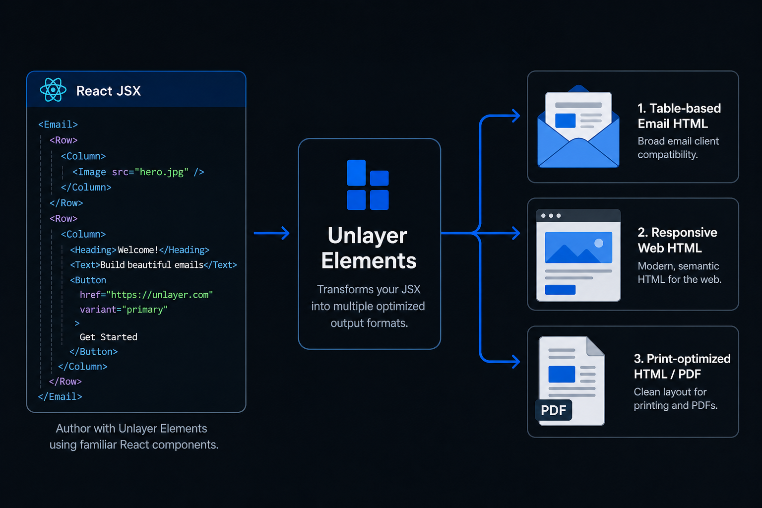
How it works
Write once in React. Render anywhere — email, web or PDF.
Available packages
Published to npm:
| npm package | Framework | Requirements | Status |
|---|---|---|---|
@unlayer/react-elements | React | 18+ (incl. Server Components) | Available |
Vue, Angular, and Svelte wrappers may follow. The docs are structured so each gets its own subsection.
Elements vs. the visual builder
| You want… | Reach for |
|---|---|
| Designs authored by non-technical users in a drag-and-drop UI | The visual builder |
| Designs authored by developers in code, lived alongside the rest of your codebase, version-controlled and reviewable | Elements |
| Both — designers in the editor, devs in code, sharing the same design JSON | Both — they round-trip via renderToJson / Unlayer's load API |
Quick start
import {
  Email,
  Row,
  Column,
  ColumnLayouts,
  Heading,
  Paragraph,
  Button,
  renderToHtml,
} from '@unlayer/react-elements';

function WelcomeEmail() {
  return (
    <Email backgroundColor="#f0f0f0" contentWidth="600px">
      <Row
        layout={ColumnLayouts.OneColumn}
        backgroundColor="#ffffff"
        padding="20px"
      >
        <Column>
          <Heading fontSize="24px">Welcome!</Heading>
          <Paragraph html="Thanks for signing up." fontSize="14px" />
          <Button
            href="https://example.com"
            backgroundColor="#0879A1"
            color="#ffffff"
          >
            Get Started
          </Button>
        </Column>
      </Row>
    </Email>
  );
}

const html = renderToHtml(<WelcomeEmail />);
Three rendering modes
Three semantic root wrappers, each tuned for a different output. The same content components (Row, Column, Heading, Paragraph, Button, etc.) work inside all three — the wrapper decides the mode.
| Wrapper | Output | Target |
|---|---|---|
<Email> | Table-based HTML | Email clients (Outlook, Gmail, Yahoo, Apple Mail) |
<Page> | div + flexbox HTML | Responsive web pages |
<Document> | Print-tuned HTML | PDF generation |
For explicit mode control or threading an SSR config through, use the lower-level <Body> primitive.
Structural shape
Every tree follows the same nesting:
<Email | Page | Document | Body>
  <Row layout={...}>
    <Column>
      ...content components...
    </Column>
  </Row>
</...>
The renderer relies on this shape to produce email-safe output; skipping levels (content directly inside Row, Row directly inside Email) throws at validation time.
Render functions
Pure synchronous functions that turn a component tree into:
- HTML —
renderToHtml,renderToHtmlParts - Plain text —
renderToPlainText(for thetext/plainpart of a multipart email) - Design JSON —
renderToJson,renderRowToJson(loads into the visual editor for round-tripping)
No client-side runtime is required.
Highlights
- 15 components —
Button,Heading,Paragraph,Image,Divider,Social,Menu,Table,Video,Html, plus layout primitives. - Server Components friendly — works with Next.js App Router, Remix, and any SSR framework. Zero client-side JS required.
- Clean HTML output — no React hydration markers.
- TypeScript-first — full type definitions and autocomplete for every prop.
- Tiny — under 50KB ESM, tree-shakeable.
Where to go next
- React → Installation · Quickstart
- Vue, Angular, and Svelte wrappers may follow.
Related
- Cloud API — export the designs you build with Elements to PDF, image, or ZIP.
- Design Schema — the design JSON format Elements emits via
renderToJson().