Style Guide
Paid Feature
This feature is only available in paid plans. Learn More
This feature helps you create templates that follow a desired brand style. You can configure pre-defined styles for each tool, which can then be applied by your users using a dropdown.
When a tool has a Style Guide applied, its styles cannot be edited, ensuring it maintains the expected appearance.
Setting up Style Guide
Enable feature
unlayer.init({
  features: {
    styleGuide: true,
  },
});
Defining the Style Guide styles
To define Style Guide styles, use the unlayer.setStyleGuide({ ... }) method. See the examples below for API implementation details. All tool values are supported inside the values field.
Button example
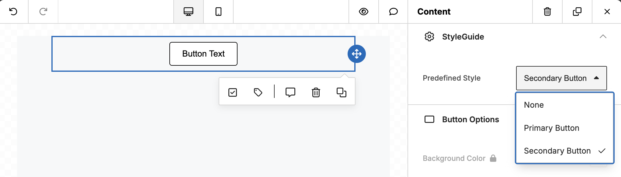
Button - Default
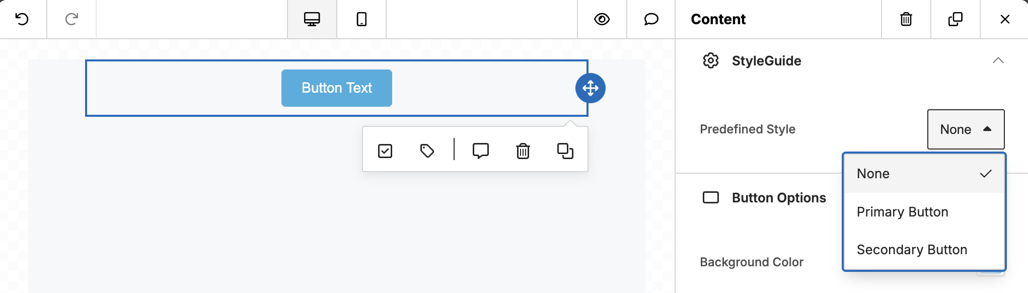
Button - Primary Style
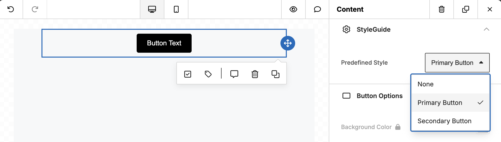
Button - Secondary Style
Code
unlayer.setStyleGuide({
  tools: {
    button: {
      styles: {
        primary: {
          label: 'Primary Button',
          values: {
            buttonColors: {
              color: '#ffffff',
              backgroundColor: '#000000',
              hoverColor: '#ffffff',
              hoverBackgroundColor: '#000000',
            },
            border: {
              borderTopWidth: '1px',
              borderTopStyle: 'solid',
              borderTopColor: '#000000',
              borderLeftWidth: '1px',
              borderLeftStyle: 'solid',
              borderLeftColor: '#000000',
              borderRightWidth: '1px',
              borderRightStyle: 'solid',
              borderRightColor: '#000000',
              borderBottomWidth: '1px',
              borderBottomStyle: 'solid',
              borderBottomColor: '#000000',
            },
          },
        },
        secondary: {
          label: 'Secondary Button',
          values: {
            buttonColors: {
              color: '#000000',
              backgroundColor: '#ffffff',
              hoverColor: '#000000',
              hoverBackgroundColor: '#ffffff',
            },
            border: {
              borderTopWidth: '1px',
              borderTopStyle: 'solid',
              borderTopColor: '#000000',
              borderLeftWidth: '1px',
              borderLeftStyle: 'solid',
              borderLeftColor: '#000000',
              borderRightWidth: '1px',
              borderRightStyle: 'solid',
              borderRightColor: '#000000',
              borderBottomWidth: '1px',
              borderBottomStyle: 'solid',
              borderBottomColor: '#000000',
            },
          },
        },
      },
    },
  },
});
Default Styles
Initial Style Guide value
In this example, newly dropped buttons would have the primary Style Guide style by default:
unlayer.init({
  tools: {
    button: {
      properties: {
        _styleGuide: {
          value: 'primary',
        },
      },
    },
  },
});
Default style without any Style Guide value
In this example, newly dropped buttons without any Style Guide set would have this style by default:
unlayer.init({
  tools: {
    button: {
      properties: {
        buttonColors: {
          editor: {
            defaultValue: {
              backgroundColor: 'green',
              // ...
            },
          },
        },
      },
    },
  },
});
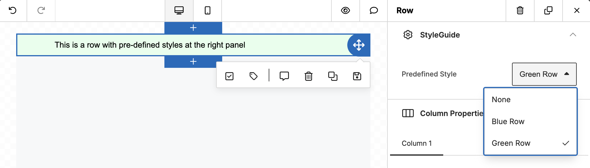
Row example
Row - Default
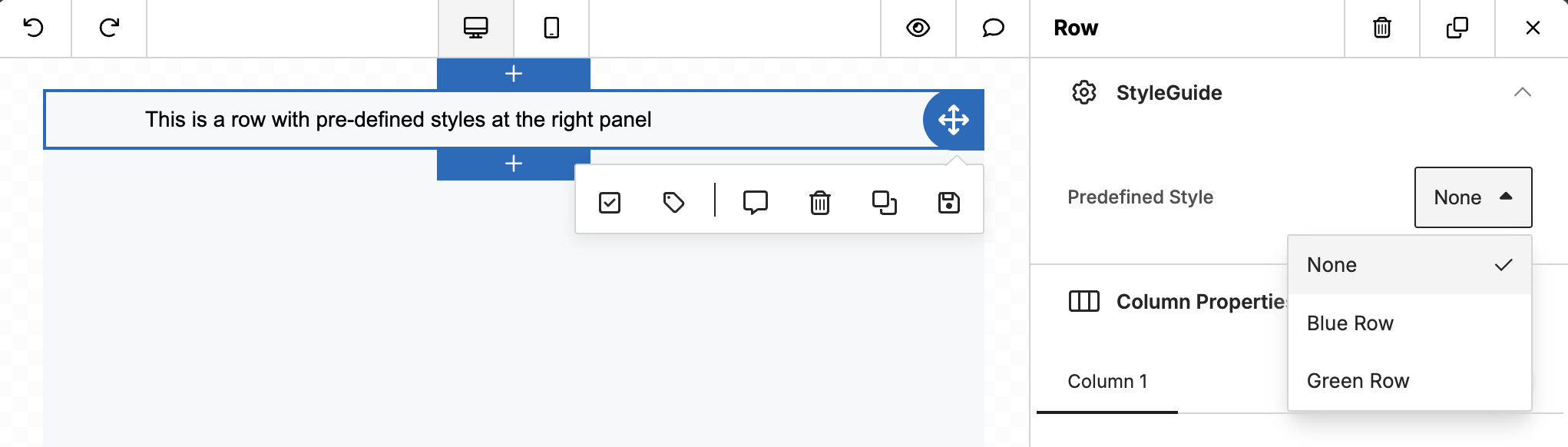
Row - Blue Style
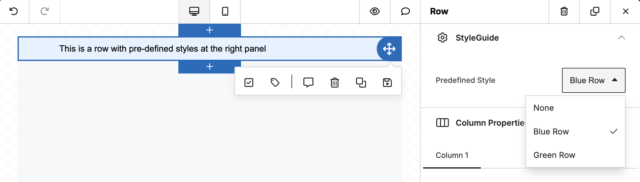
Row - Green Style
Code
unlayer.setStyleGuide({
  tools: {
    rows: {
      styles: {
        blue: {
          label: 'Blue Row',
          values: {
            backgroundColor: '#E5F2FF',
          },
        },
        green: {
          label: 'Green Row',
          values: {
            backgroundColor: '#E5FFEC',
          },
        },
      },
    },
  },
});
Body example
unlayer.setStyleGuide({
  tools: {
    bodies: {
      styles: {
        green: {
          label: 'Green',
          values: {
            textColor: '#206154',
            backgroundColor: '#BFEDD2',
            linkStyle: {
              body: true,
              linkColor: '#169179',
              linkHoverColor: '#169179',
              linkHoverUnderline: true,
              linkUnderline: true,
            },
          },
        },
      },
    },
  },
});
Custom Tool example
unlayer.setStyleGuide({
  tools: {
    'custom#my_custom_tool': {
      styles: {
        green: {
          label: 'Green',
          values: {
            color: '#206154',
          },
        },
      },
    },
  },
});